Copper was notably weak in Q1. Copper, the only market that has a "PhD in economics", hence its nickname "Dr. Copper," was down 8.4%. This is concerning given that the copper market is considered by many to be a barometer for the general health of the worldwide economy. Japanese and European stocks were weak too, making US stocks look good by comparison. The Nikkei lost 5.4% and Euro Stoxx lost almost 6%. The MSCI All-World Index ended a 7 quarter winning streak. Despite the turmoil in the FANG stocks, the NASDAQ was actually up on the quarter. The Dow and S&P both lost ground, with losses of 2.6% and 1.44%, respectively. Both indexes ended 9 quarter winning streaks. The USD was down for the 5th straight quarter, mostly against the yen and the British pound this time.
VIX was a big winner in the first 3 months of the year, with its biggest quarterly spike since 2011. Grain markets and energy also showed strength. Gold was slightly positive, but continues to show signs of uncertainty regarding its future direction.
March saw some major curve flattening. The 2 year-30 year spread fell to its lowest levels since 2007.
There are a couple major economic data points to consider. Change in Non-farm Payrolls failed to meet expectations in early January and the Unemployment Rate held steady at 4.1%. US CPI data released on January 12 showed a slight up tick when you exclude food and energy, rising from 1.7% to 1.8%. The BoJ continues to hold rates at a negative 10 basis points. Rates in the Eurozone are at 0%. The beginning of Febuary showed a beat in Non-farm Payrolls, with 200k jobs being created. Again, the unemployment rate remained at 4.1%. The RBA held rates at 1.5% and the RBNZ held rates at 1.75%. The BoE is holding rates at .50%. CPI data released in Febuary showed an uptick, beating the 1.9% expectation by 20 basis points. At the beginning of March, PCE Core was released, which is what the Fed looks at to get a read on inflation. That held steady, and met expectations, at 1.5%. There appears to not be inflation, but is it possible that we just aren't looking in the right place, a la Alan Greenspan not noticing the inflation in the housing sector?
The Fed met on the 21st of March and raised rates by 25 basis points as everyone expected. The question now is whether we will see 2 or 3 more hikes this year. Next Friday's release of jobs data might give a hint.
US Stocks
January ended 5 months of gains in the S&P and 7 months of gains in the NASDAQ. The NASDAQ briefly put in fresh highs in March, but then fell. The S&P fell a bit harder, getting nearer to the February lows. Both indexes are above major trendlines and moving averages. Monthly charts:


Things get a little dicier on the daily charts (below). Here we can see the March decline in the S&P bringing us dangerously close to the 2530 low set in February. We are also below the 50 and 100 day moving averages, which is a sign of short-term negative sentiment. So far, the 2,600 level is holding. In the NASDAQ, we seem to be holding the 7,000 level for now. We closed out the month by testing the 100 day moving average. Again, being below both of these is indicating negative sentiment. Should we break the 200 day moving average, the 2,600 level in the S&P 500 (which is right at 2,600), I think further selling would be triggered.


The takeaway here is that the long-term bull trends are in-tact, but in the shorter-term, caution is warranted.
Metals
As aforementioned, copper was a loser this quarter. It was down all three months, closing out just above the 3.00 level. The daily chart here has a similarity to the daily equity charts above: we are decidedly below the 50 day and 100 day moving averages, but the 200 day moving average is in a more ambiguous situation. The low from December of last year at 2.9380 needs to be taken out before we can call this a downtrend. Below are the daily and monthly copper charts.


Keeping with the metals, we can see that the gold market has been moving sideways following its year-end rally of 2017. A low of 1240 was put in, and then we blasted off into the new year. Eventually a high of 1364 was put in. Since then, we have been moving sideways between that level and about 1310. A break below 1310 would indicate further downside.

The monthly chart reinforces the fact that this market has not been doing much. The formation here is bullish, and a break above the recent highers around 1360 would could mean a retest of old support above 1500. Long-term, I am bullish on gold, even if we see a breakdown below 1,300. For the longer-term pattern to be considered bearish, the low from late 2016 would have to be taken out.

Currencies
The dollar's daily chart shows 3 tests right around the 88.500 level. The fact that we are holding is a good sign for the dollar bulls. The fact that we have knocked on this door a few times is not such a good sign for dollar bulls. I would like to see a close above the high that was put in during March, around 90.750. That was the level where the possible double-bottom failed, but if we close above it, this would become a triple-bottom, and thus a major base.

The monthly chart paints a picture that is a bit harder to decipher. The most recent major move was the rally in 2014 and early 2015. Since then, 3 major highs have been put in. Following the most recent high, an extensive decline has taken hold. This is really a tough call, and I think at least a short-term bounce may be needed to shake out weak shorts. Perhaps then, further downside is possible.

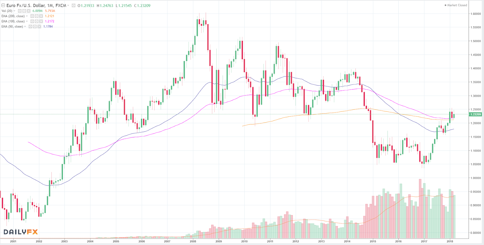
The euro has spent most of 2018 consolidating between 1.22 and 1.25. All major moving-averages are holding, and the trend here is clearly higher. Given that the euro is a major component of the dollar index, this would indicate further dollar weakness.

You should not be too surprised that the monthly euro chart almost looks like a mirror image of the monthly dollar chart above. Here, we can see the 1.25 handle being tested.
The last currency to look at is the yen. Given its status as a safe-haven due to the carry trade, it has important ramifications for just about everything. In the past, the yen pairs have often shown high correlation to US stocks. Please keep in mind that when looking at these yen charts, they are inverse. Meaning that when prices are rising, that actually means the yen is falling in dollar terms. When prices are falling, the yen is actually rising.
The daily yen chart shows general strength versus the greenback. In February and March, we have seen 3 new major lows. We are below all major moving averages. The trend here is clearly lower.

On the monthly chart, despite the weakness (yen strength) so far this year, it still appears that this market doesn't know where it wants to go. When the moving averages cross and flat-line, as they have here, it indicates indecision. Generally I find it safer to bet on that indecision continuing rather than guessing which way the market will eventually move.

Crude Oil
Oil saw 5 months of higher prices coming into 2018. February was the first negative month following that rally. March saw another push higher. So far, oil prices have been unable to sustain above $66. We are above the moving averages and have put in multiple higher lows, indicating that buying pressure is still present. I think a pop through $66 is the most likely scenario. Above that, we might begin to see resistance form at old support. $75 would be a level to watch there.


Volatility
I just wanted to post a chart of VIX to put the recent spikes in perspective. The spike in February puts the spike in March to shame. That is to be expected, at least somewhat, given the violence of February moves. The structural problems of some VIX products also must be taken into consideration.

Bonds and Financial Stocks
Financial stocks, shown here as the $XLF ETF, have yet to take out their pre-Financial Crisis highs. We came close before the downturn in February. I like to watch this sector because it often gives clues as to what is going on in the economy before the other sectors or indexes do. The monthly chart shown here is still clearly bullish, but the potential resistance above from 2007 is worrisome.

The 30-year has turned higher while the 2-year has struggled. This means that longer-term yields are falling faster than shorter-term yields, and that the curve is flattening. This is generally interpreted as a signal that the Fed is tightening and could throw the US into another recession.
This is seen on the daily charts below. The 2-year futures chart is followed by the 30-year futures chart.


The last chart to look at is the monthly 30-year bond chart. Major lows were put in during February. March saw some respite, but as long as we are holding below the 148'00 level, I think bias remains to the downside.

For more information/detail on any of the markets discussed above, or if you would like analysis of another market, email your request(s) to jd.erdmier@gmail.com